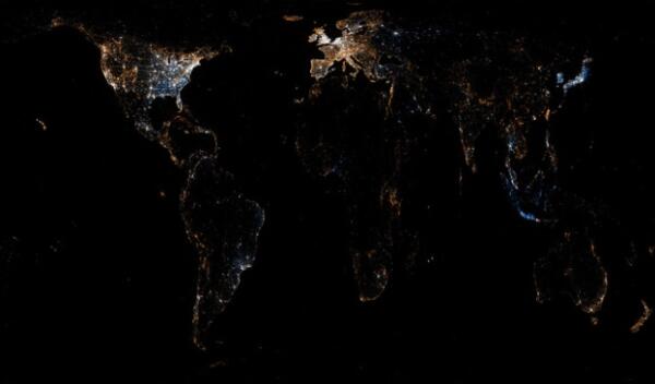
Cool Visualization of Twitter and Flickr Usage Around the World
Today, The Atlantic posted some beautiful visualizations of Twitter and Flickr usage around the world. The images were originally created by Eric Fischer and posted to his Flickr page. The blue dots in the images below represent Twitter and the red are Flickr. In addition to the pure beauty of these images, there are also some interesting conclusions that can be drawn from them.
Here's the image of the US, followed by some thoughts:
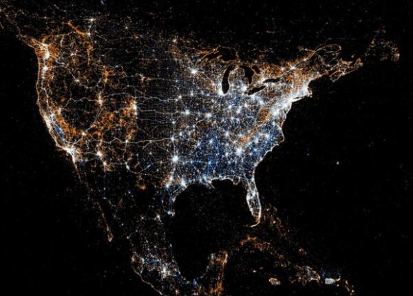
First, I think they serve as a great reminder that the growth that is still available in these channels. There are vast dark spaces in the US and especially in the world where no one is connected to either service. I don't think everyone in the world should be tweeting, but it is pretty eye opening that there are pretty wide chasms in usage around the country.
Next, it's a great demonstration of how networks have natural fits. Flickr is more widely used in places in the west where there are beautiful mountains and scenic trails to hike than it is in my home state of Ohio. On the world scale, you see Japan brightly lit up in blue due to that nation's deep connection to technology and also likely due to the importance of Twitter being validated to the Japanese during the terrible earthquake and tsunami in March.
Finally, the images really show the connecting between use of new technology and infrastructure. The networks are the most widely used in areas where there is robust technical infrastructure, typically places like cities. Just reaffirms the importance infrastructure and cities will play in connecting the whole world.
Enough talk, enjoy the images.